
A good friend and colleague came to me with an idea; to infuse the Golden Ratio throughout a design system. Adopting the same approach as great artists and architects of old to easily craft UI into something truly remarkable.
Situation
During our time at Brandfuel, Michael Ruocco spoke to me about an idea he had started to develop.
We were both used to working with design systems. Michael’s idea was a new kind of system, one that infused the golden ratio into every element of a design system and asked if I was available to help him push the idea further as he had hit a bit of a wall.
After work, we grabbed a coffee, opened the laptop and started talking it through in more detail and more specifically, the wall he had hit. Essentially, he had an idea how we might implement the golden ratio into type and a couple of other areas. But that was pretty much it, which left a lot on the table needing a solution—exactly the kind of challenge I love.
Task
I needed to explore how to easily use the golden ratio to somehow create and arrange all the elements within a design.
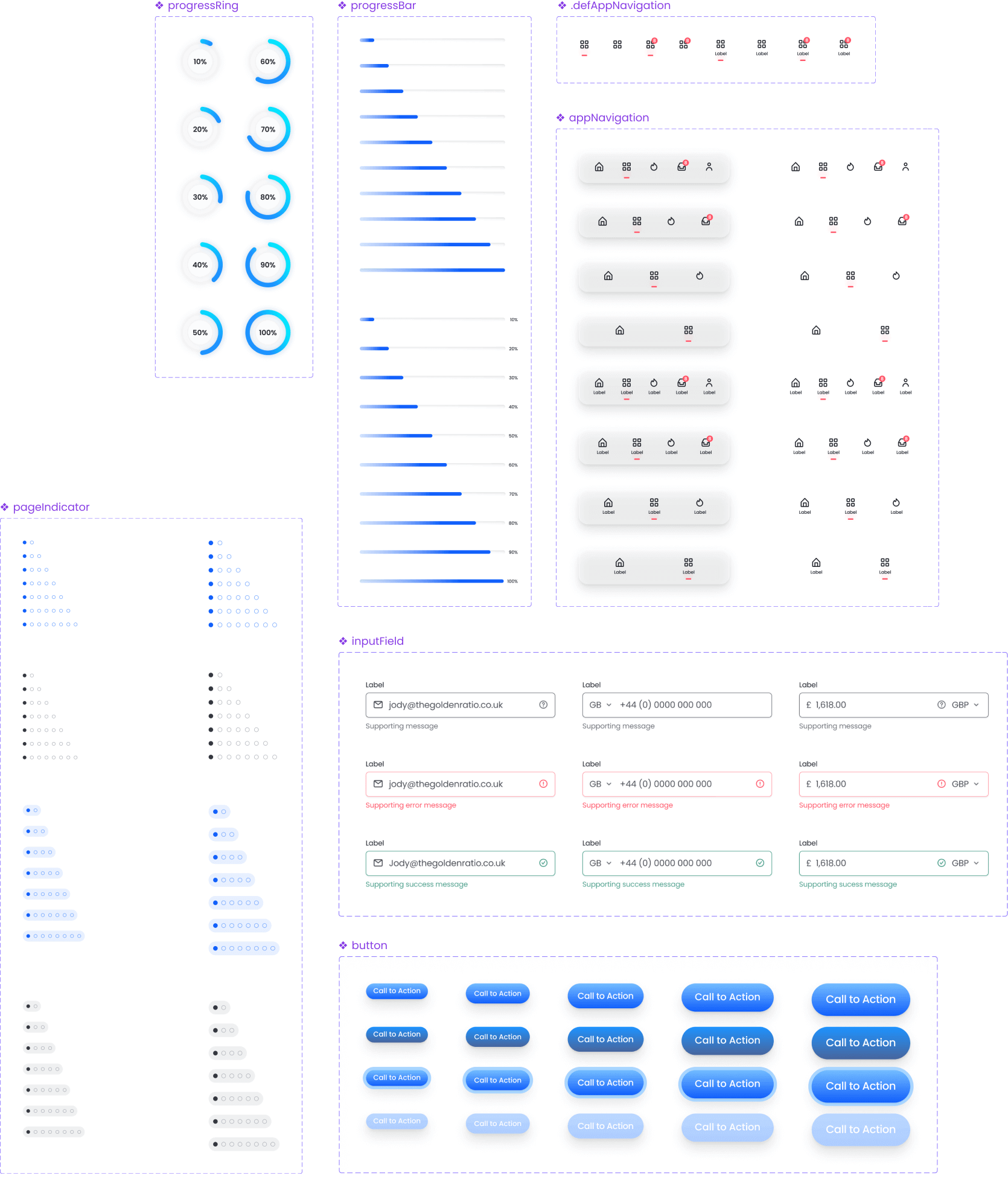
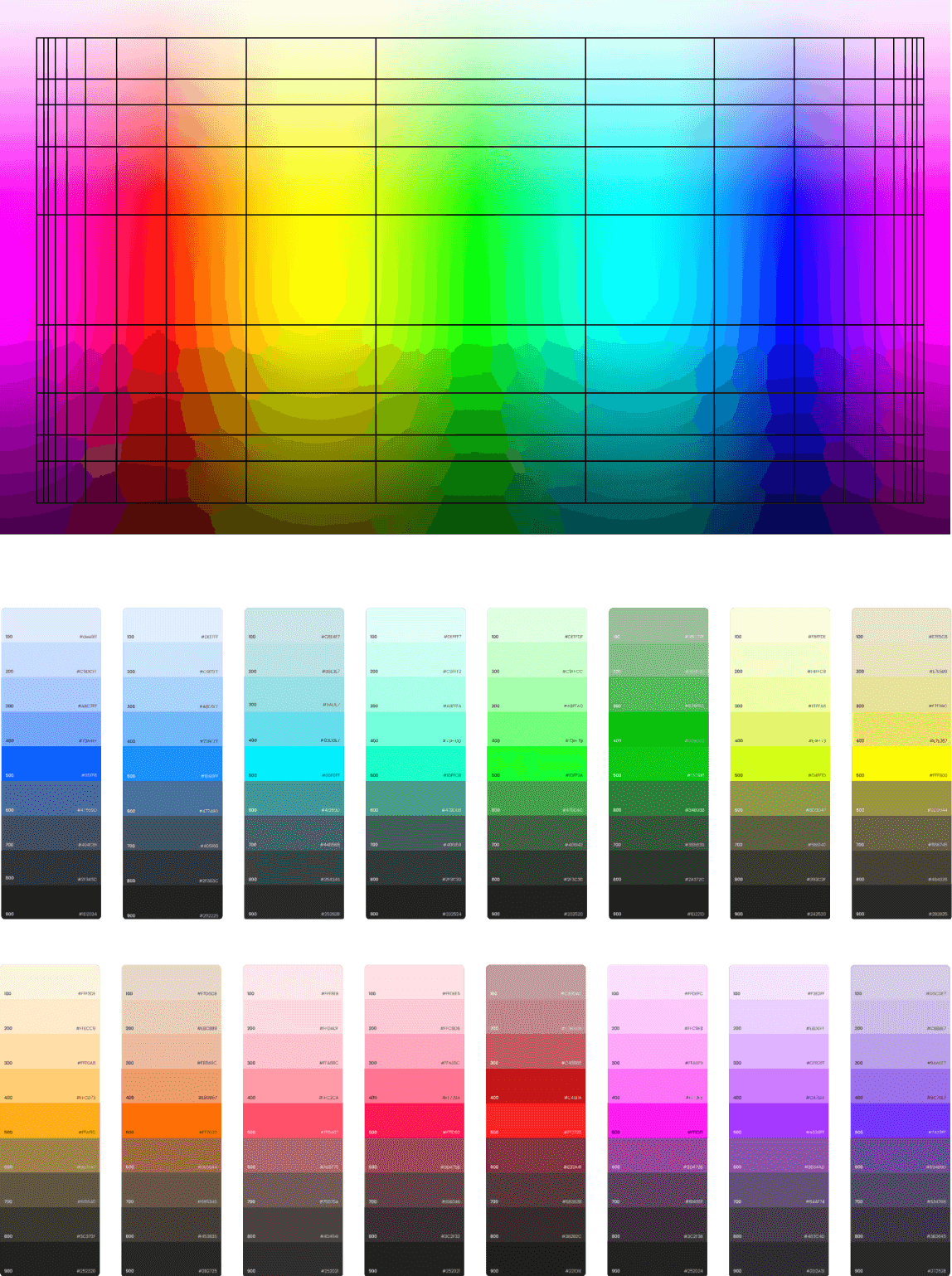
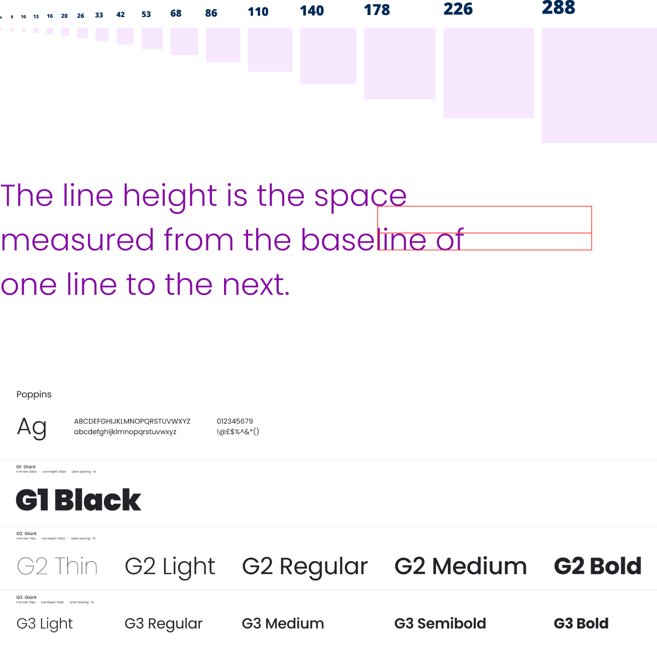
The specific areas that needed a golden ratio solution were; layout system or grid, colour, buttons initially (all components needed to follow the same rationale), typography, icons, spacing, shadows, blurs, tokens etc.
The solution had to be easy and intuitive so it would be adopted.
Action
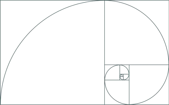
To have any chance of finding solutions to all the questions I was facing, I started by gaining a comprehensive understanding of what the golden ratio is.
This led to extensive exploration. Re-creating it from scratch, looking at the math and ways it could be of use. It revealed how artists like Leonardo da Vinci, Raphael, Michelangelo and more constructed their masterpieces. How architects used it extensively in amazing structures like the Great Pyramids of Giza, the Parthenon, Notre-Dame and the Taj Mahal.
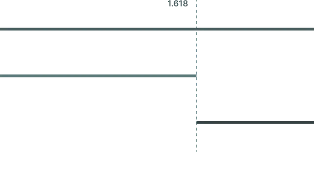
All of these incredible pieces of art and architecture used the golden ratio as a type of grid or spacing system. Beneath them all, one magic number / ratio stands out, 1.618.
I started applying this ratio, multiple times, across a single line to see if they’d retain the ratio when made responsive—and they did. Which meant I could imitate this layout system for the ideal placement of elements between two points within everything. It was the solution I had been searching for. The golden ratio grid was born.
Results
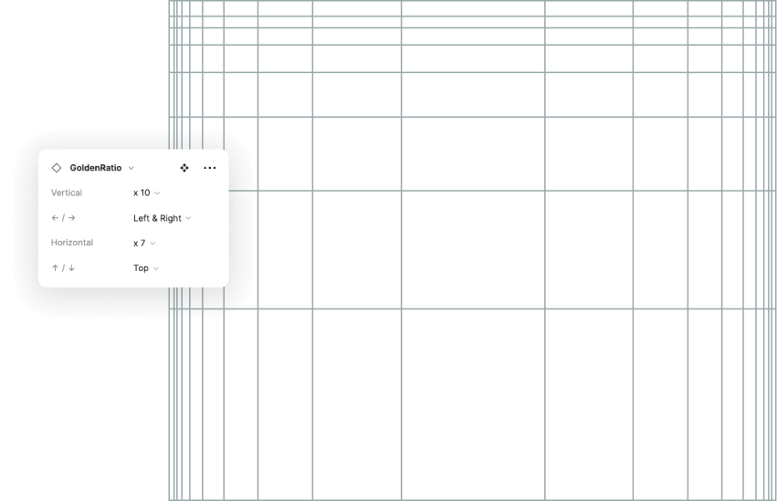
The first golden ratio grid was created as a Figma component, but with 1680 variations, it was a huge drain on the design files so a more elegant solution was needed.
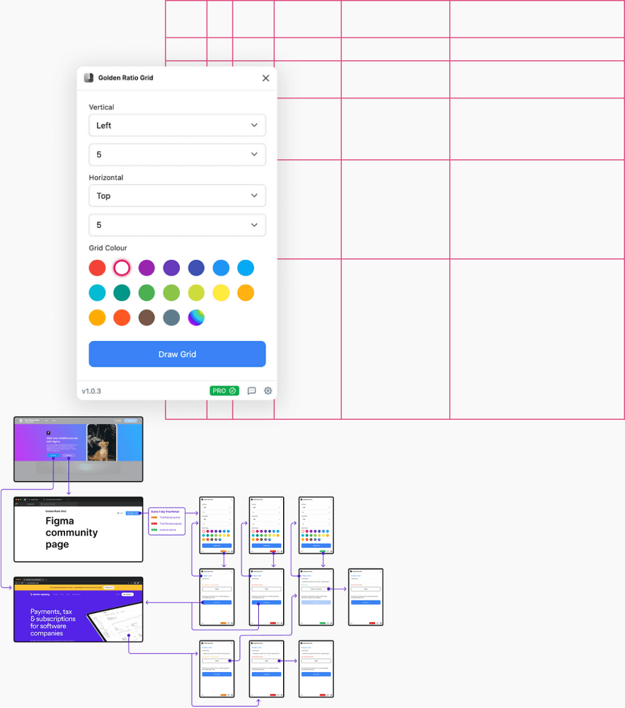
Which led the Figma Golden Ratio Grid plugin to be born. A separate, simple, solution that kept Figma files and libraries lean. In addition to this, plugins were also created for both Sketch and Photoshop.
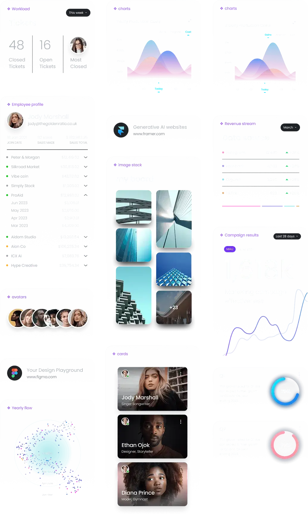
The design system quickly took shape, now with each component using the golden ratio spacing system. Colours, typography (including line-height), etc. all using the Golden Ratio Grid in some way to include the 1.618 ratio. It took time to cover all the elements, but in the end, everything tied together nicely.
After the design system had been live for just shy of a year, LinkedIn got in touch to see if we would be open to creating a course on how to use the golden ratio within all aspects of digital design.
Here’s a link to the course if you’d like to check it out Designing with the Golden Ratio
Understanding the golden ratio
Golden Ratio Grid - Figma component
Golden Ratio Grid - Figma plugin
Design System - components
Design System - colour, typography
Design System - built with examples




LinkedIn Learning course


