Having worked on a number of projects for Straylight previously, I got the call asking if I was available to work on a ‘first of its kind’ Video On Demand aggregator. Where every streaming service you’re subscribed to, is brought together to work within one unified platform.
Situation
ScreenhitsTV had a fully working product, the issue was, they were aware of how it looked. The experience was lacking and made the product feel cheap and unconsidered, as if it were designed whilst it was being developed. Which it was, by the developer.
Although there were UX issues, they approached Straylight to explore the UI only for a number of key areas that existed and some that didn’t. They wanted to have an holistic view of what their product could be. They wanted it to stand shoulder-to-shoulder with the current, slick looking, Video On Demand services. They wanted a product that both they and their users could be proud of.
Task
A complete overhaul of the keys areas listed below, to show what the screenhitsTV platform could be.
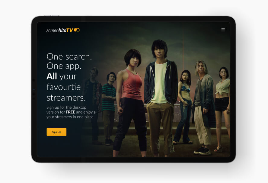
- Sign up splash
- Log in
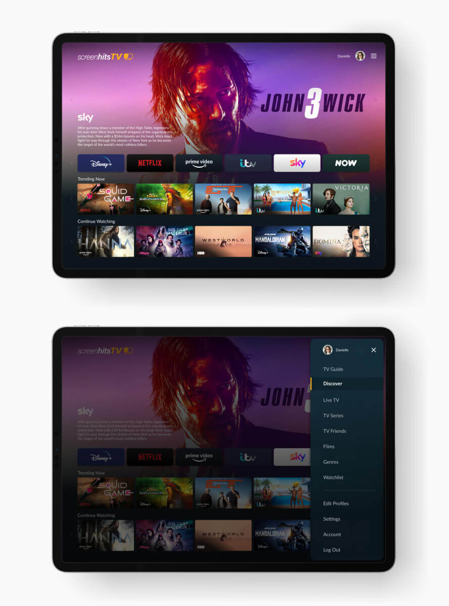
- Menu navigation
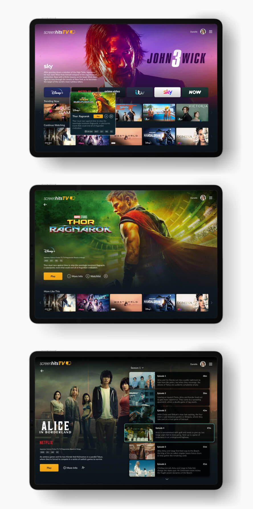
- Explore various pages with hero banners. What do these look like? How do we revere the content while remaining consistent within a screenhitsTV framework?
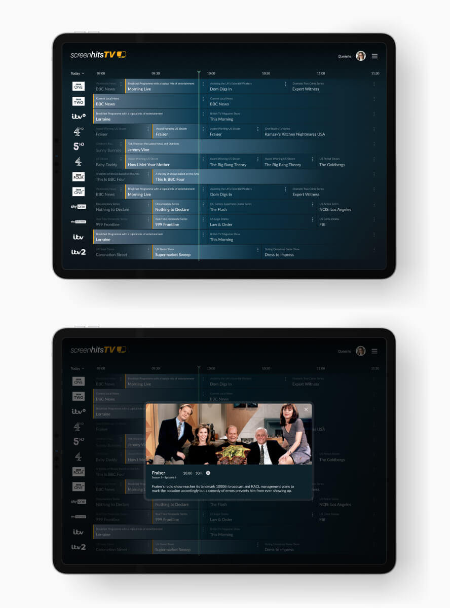
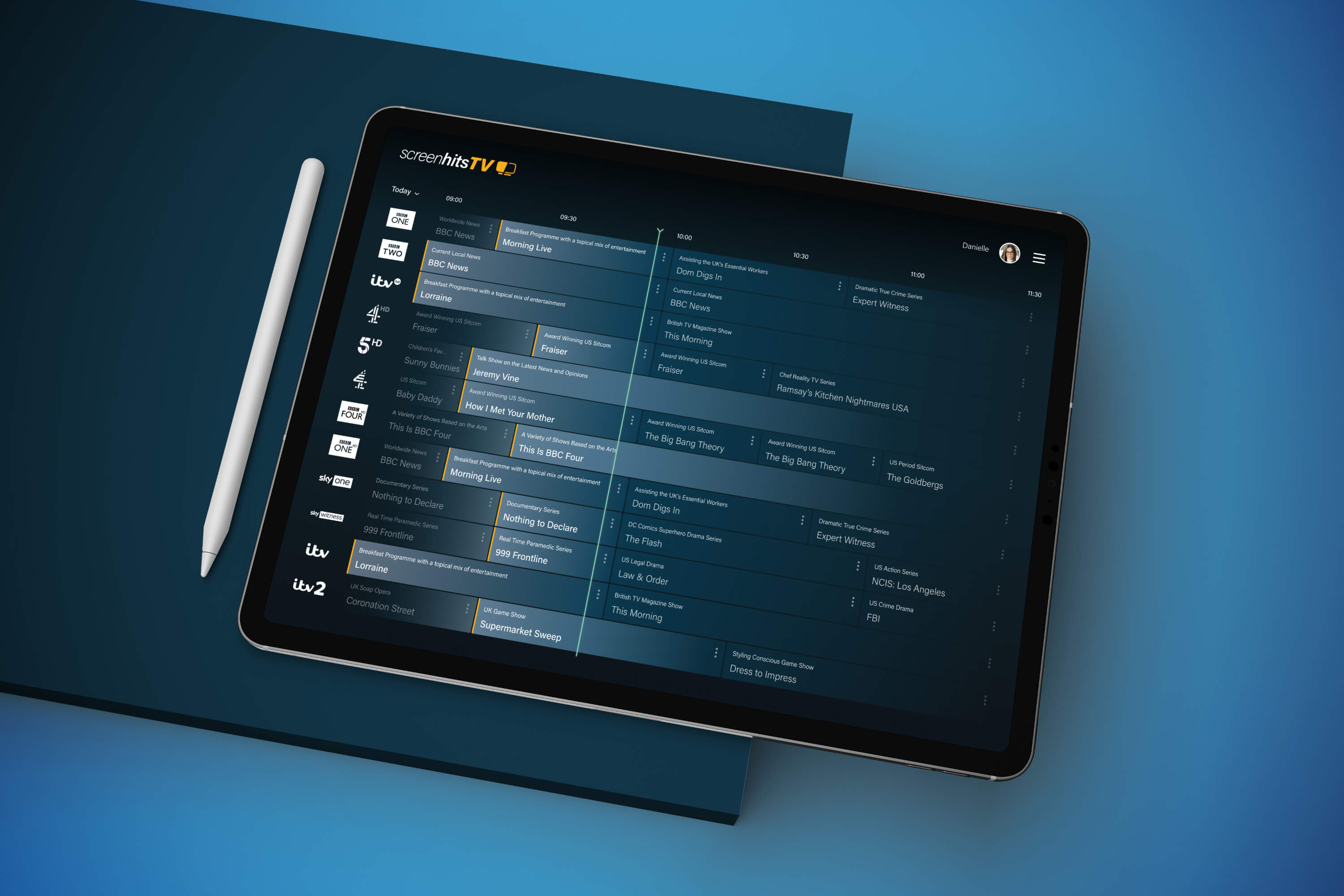
- Live TV schedule
Action
After a kick-off call to discuss the brief with the client, I started by creating a brief statement of intent to define the problem I had to solve. Which ended up being ‘Evaluate the current screenhitsTV experience and identify how it can be enhanced’. Simple enough, but it helps me channel my thinking and gives me something tangible to focus on, rather than simply ‘exploring’, which can feel never ending.
Having no actual users available to talk to, I began with generative research. Logging in to screenhitsTV and walking through all the journey’s, looking for patterns, making notes of answers to questions like ‘why was this designed this way?’, ‘why does this feature work this way?’, ‘why was this pattern introduced?’ and so on.
I then conducted competitive analysis. Looking at where the client wished they were, identifying patterns used by their competitors and how they may help or hinder the final designs I would go on to create.
The answers to the above provided me with invaluable direction. The client just wanted to see something that would WOW them and their users, but this begins with understanding the flaws of their current product. Only then could I go on to design a deeper, more meaningful experience that ultimately answers the brief and solves the clients ‘problem’.
Outcome
The research helped me to refine patterns, making the UI more consistent which unified the overall experience. I was able to use my findings to springboard the designs, pushing the product into a realm that was infinitely more polished and considered.
The client were thrilled with the results. So much so, they invited me to discuss my designs with their design team. My designs formed the foundation of how their product looks today.
Further to this, I was invited to discuss my designs in detail with Porsche and how they can implement them within their in-car entertainment systems.
Existing designs
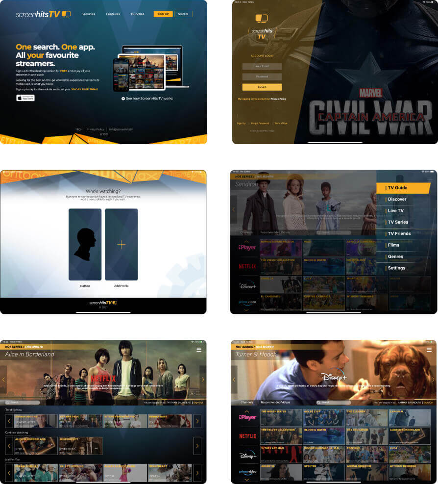
Sign up splash
Log in
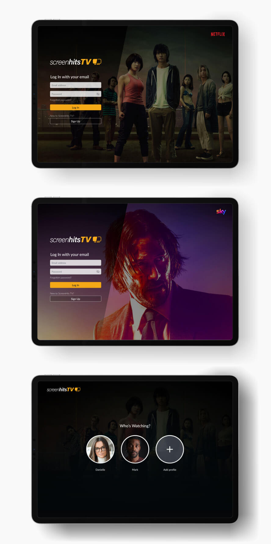
Home screen and menu
Film and Series selection screens
Live TV schedule
